-
Ch8. Introducint Stacks & ContainersRay Wenderlich/SwiftUI 2021. 2. 7. 20:20

Ch8. Introducint Stacks & Containers
Layout for views with a single child
struct ChallengeView: View {
  var body: some View {
		Text("Hello World!")
		  .background(Color.red)
  }
}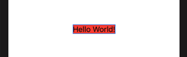
Text("A great and warm welcome to Kuchi")
  .background(Color.red)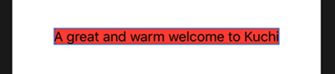
SwiftUI가 ParentView와 ChildView의 사이즈를 결정하는 방식
- Parent view가 생성될 때, 사용 가능한 프레임을 결정한다.
- Child view에게 이 프레임을 제안한다.
- Child view는 Parent view가 제안한 사이즈를 고려하여 자신의 사이즈를 결정한다.
- Parent view는 Child view가 정한 사이즈를 기반으로 사이즈를 재조정한다.
이 과정이 root view부터 recursive하게 일어난다.
Text("A great and warm welcome to Kuchi")
  .background(Color.red)
  // fixed frame size
	.frame(width: 150, height: 50, alignment: .center)
	.background(Color.yellow)
- frame의 결과로 고정된 크기를 가진다. 150x50
- parent view는 그래서 Text에게 150x50을 제안한다.
- Text는 제안받은 사이즈 내에서 텍스트를 다 표현할 수 있는 방법을 찾는다.
.frame(width: 300, height: 100, alignment: .center)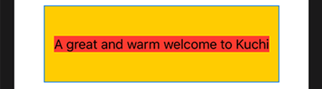
텍스트가 제안받은 사이즈를 다 쓰지 않고 필요한만큼만 쓰고 있음 (빨간색)
.frame(width: 100, height: 50, alignment: .center)
조건을 만족하는 프레임에 텍스트를 다 표현할 수 없어 뒤가 잘렸다.
특별한 조건(.minimumScaleFactor modifier)이 없다면 이렇게 싹둑 잘라버림
Text("A great and warm welcome to Kuchi")
  .background(Color.red)
  .frame(width: 100, height: 50, alignment: .center)
  .minimumScaleFactor(0.5)
  .background(Color.yellow)
보통 컴포넌트들은 parent가 제안한 사이즈에 컨텐츠를 최대한 사이즈를 맞추려고 한다. 만약 공간이 부족하다면 컴포넌트 타입에 따른 룰을 적용시킨다.
child는 parent가 제안한 사이즈를 고려하여 자신의 컨텐츠를 적용하려고 한다.
Image("welcome-background")
  .background(Color.red)
  .frame(width: 100, height: 50, alignment: .center)
  .background(Color.yellow)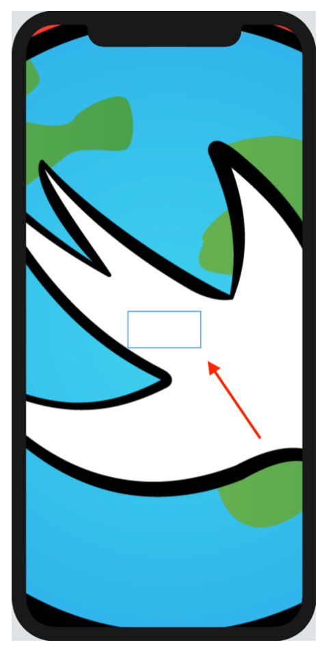
가운데 빨간 화살표가 가리키는 영역이 100x50이다.
특별한 modifier가 없으니 이미지는 제안받은 사이즈(100x50)을 무시하고 자기 자신의 해상도대로 렌더링되고 있다.
Image("welcome-background")
  .resizable()
resizable()로 제약을 걸어줌
이번 섹션을 통해 Parent가 Child의 사이즈를 강제할 수 없다는 것을 알았다.
단지 사이즈를 제안할 뿐이다.
Layout for container views
Container view가 서브뷰들의 사이즈를 결정하는 과정
- Container view가 사용가능한 프레임을 결정한다. (보통은 자신의 parent로부터 제안받은 사이즈)
- Child view중에서 가장 우선순위가 높은 (with most restrictive constraints)view를 선택한다. 만약 같은 우선순위라면 사이즈가 작은 view 우선
- Child view에게 사이즈를 제안한다. 이 때, 제안하는 사이즈는 n빵이다. 사용가능한 사이즈 / Child수
- Child view는 제안받은 사이즈를 기반으로 자신의 사이즈를 결정한다.
- Container는 Child가 선택한 사이즈를 제외하고 남은 사이즈로 Step2로 돌아가 계속 진행한다.
HStack {
  Text("A great and warm welcome to Kuchi")
    .background(Color.red)
  Text("A great and warm welcome to Kuchi")
    .background(Color.red)
}
.background(Color.yellow)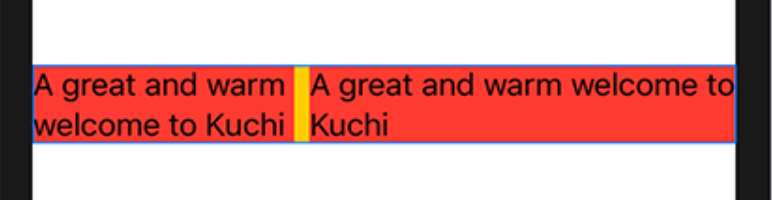
- HStack은 Parent에서 전달받은 사이즈를 둘로 나눈다.
- 둘로 나눈 사이즈 하나를 첫번째 Child(왼쪽Text)에게 제안한다.
- Text는 제안받은 사이즈보다 적은 사이즈를 사용하기로 결정했다. 제안받은 사이즈로는 1줄로 나타낼 수 없었기 때문에 2줄로 표현하면서 2줄의 길이가 비슷한 사이즈를 사용하기로 한다.
- HStack은 왼쪽 Text가 사용하고 남은 사이즈를 오른쪽 Text에게 제안한다.
- 오른쪽 Text는 제안받은 사이즈 전체를 사용하기로 한다.
*** 사실 XCode11.3, iOS14에서는 이렇게 안되던데..ㅋㅋ 참고만하자
Text("A great and warm welcome to Kuchi")
  .background(Color.red)
Text("A great and warn welcome to Kuchi") // <- Replace `m` with `n` in `warm`
	.background(Color.red)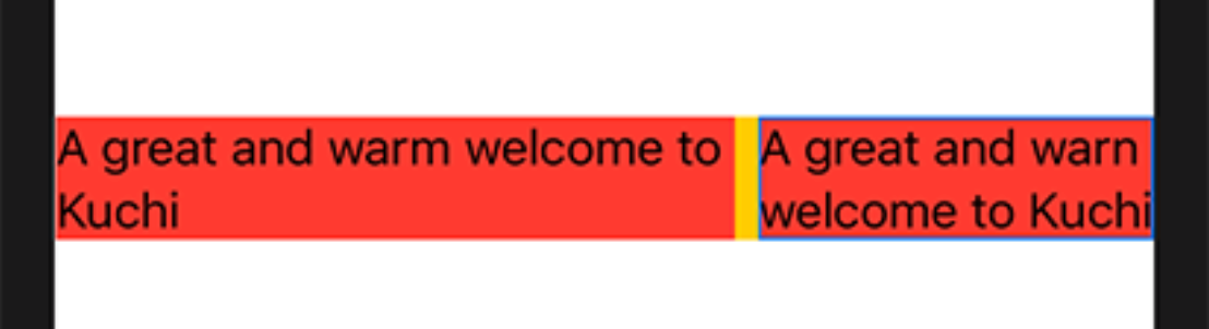
오른쪽 Text가 짧아 졌으니 Constraint 우선순위를 오른쪽이 가져갔음
Layout priority
정리하자면 Container는 Child view들의 우선순위를 결정하고 순서대로 사이즈를 제안한다.
우선순위가 같다면 더 작은 사이즈에게 먼저 물어본다.
이 우선순위를 변경해주는 2가지 방법이 있다.
- Modifier사용
- layout priority 변경
Modifier
Modifier를 통해 뷰를 More or Less Adaptive하게할 수 있다.
Image는 가장 덜 Adaptive한 뷰 중 하나기 때문에, Parent가 제안한 사이즈를 거의 사용하지 않는다. 하지만 resizable Modifier를 사용하면 완전 반대가 된다. 부모가 제안한 사이즈를 그대로 사용하게 된다.
Text는 매우 Adaptive하다. Parent가 제안한 사이즈를 기반으로 최대한 fit하게 구성한다. 하지만 maximum number of lines를 사용하게 한다면 less adaptive해진다.
Priority
.layoutPriorty를 사용하여 명시적으로 레이아웃 우선순위를 조정할 수 있다. Double값을 사용하고 양수, 음수 둘 다 가능하다. 기본 값은 0이다.
HStack {
  Text("A great and warm welcome to Kuchi")
    .background(Color.red)
  Text("A great and warm welcome to Kuchi")
    .background(Color.red)
  Text("A great and warm welcome to Kuchi")
		.background(Color.red)
}
.background(Color.yellow)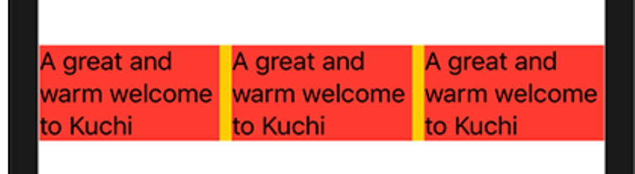
HStack {
  Text("A great and warm welcome to Kuchi")
    .background(Color.red)
  Text("A great and warm welcome to Kuchi")
		.layoutPriority(1) // Priority 적용!!
    .background(Color.red)
  Text("A great and warm welcome to Kuchi")
		.background(Color.red)
}
.background(Color.yellow)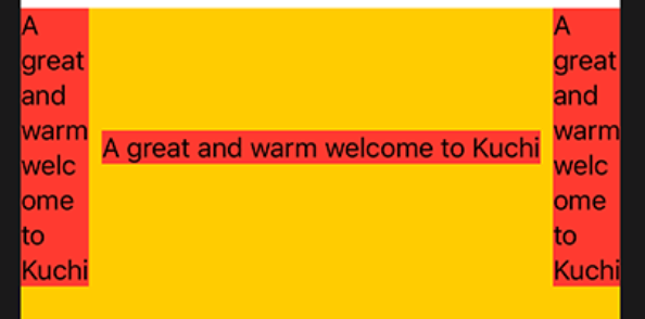
HStack {
  Text("A great and warm welcome to Kuchi")
		.layoutPriority(-1) // Priority 적용!!
    .background(Color.red)
  Text("A great and warm welcome to Kuchi")
		.layoutPriority(1) // Priority 적용!!
    .background(Color.red)
  Text("A great and warm welcome to Kuchi")
		.background(Color.red)
}
.background(Color.yellow)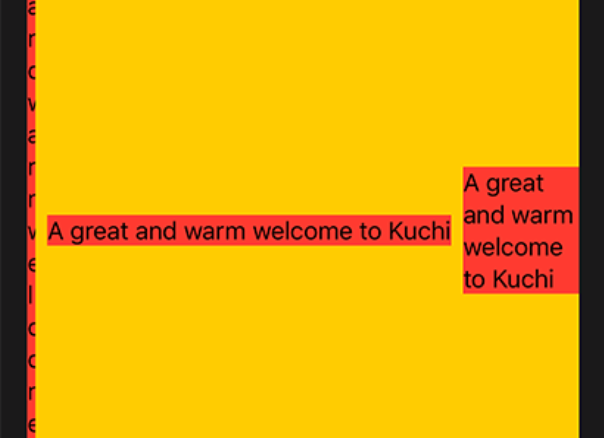
The Spacer view
VStack() {
    Spacer()
    Text(userName)
      .font(.largeTitle)
      .foregroundColor(.white)
}
Text위에 있는 Spacer는 Text를 아래로 밀어내는 효과를 가진다.
Layout 규칙을 생각해보자.
- VStack은 2개의 Child 중에 더 엄격한 Text에게 사이즈를 먼저 제안한다. 자신의 사이즈의 1/2를 제안한다.
- Text는 자신이 필요한 사이즈를 결정하고 VStack에게 알려준다.
- VStack은 남은 사이즈를 Spacer에게 제안한다.
- Spacer는 가장 덜 엄격한 컴포넌트이다. 제안받은 사이즈를 그대로 사용한다.
'Ray Wenderlich > SwiftUI' 카테고리의 다른 글
Ch12. Conditional Views (0) 2021.02.14 Ch11. Lists & Navigation (0) 2021.02.07 Ch9. State & Data Flow (0) 2021.02.07 Ch7. Controls & User Input (0) 2021.02.07 Ch6. Intro to controls: Text & Image (0) 2021.02.07